Effective Immunity Graph Generator
Effective Immunity Graph Generator
If you're a certain kind of news junky or COVID watcher you've probably found yourself on the Our World in Data: Global Vaccination Tracker, using the graphs to determine which countries are "behind" and which are "ahead" in terms of vaccinations. The problem being that in the OWID vaccination data set, there is only "at least one dose" and "fully vaccinated". We know that Fully Vaccinated Immunity is more effective than Partially Vaccinated Immunity; so you could guesstimate1 how much better one country is doing when taking that into account.
Well guesstimate no more! I've built a script which accurately creates national vaccine Effective Immunity graphs based on the OWID data set on vaccinations worldwide.
What is effective immunity
"Effective Immunity" is the measure of how protected a population is with vaccines when taking into account that there is a higher risk for partially vaccinated than fully vaccinated. The program uses data published by Public Health England which states that:
Estimates of vaccine effectiveness range from around 55 to 70% after 1 dose, with little evidence of variation by vaccine or age group. Data on 2 doses is indicates effectiveness of around 65 to 90%.
Taking the upper bound of those protection rates and subtract them from 100 to get the risk of COVID; if partially vaccinated adults have a 30% risk of symptomatic COVID when fully vaccinated adults have a 10% risk of symptomatic COVID. Dividing the risk of partially vaccinated by the risk of fully vaccinated 30%/10% = 3, therefore it is 3x as risky to be partially vaccinated as compared to fully vaccinated, or equally we can say that partial vaccination protection is 1/3 as effective as full vaccinated.
This co-efficient 1/3 is what the program uses to determine the weighted sum of the overall national Effective Immunity. This matters because some countries (like where I live in Canada) had a first dose strategy, where instead of trying to get everyone fully vaccinated we instead got everyone partially vaccinated first and much later rolled out the second doses. This was to deal with our contained supply issues2.
Try it for yourself
Link to the files to run this yourself.
I deliberately made the program so that anyone with python installed on their computer could download the program
and run it for themselves. All you need to do is edit the ISO codes found in the countries list. So for example if I wanted
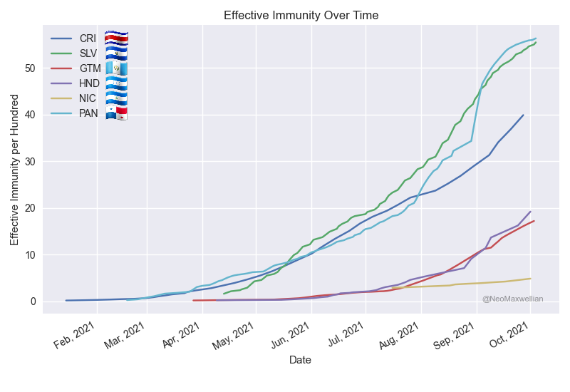
to compare Central American countries3 I would change it to:
countries = ["CRI", "SLV", "GTM", "HND", "NIC", "PAN"]
Which would result in this graph:
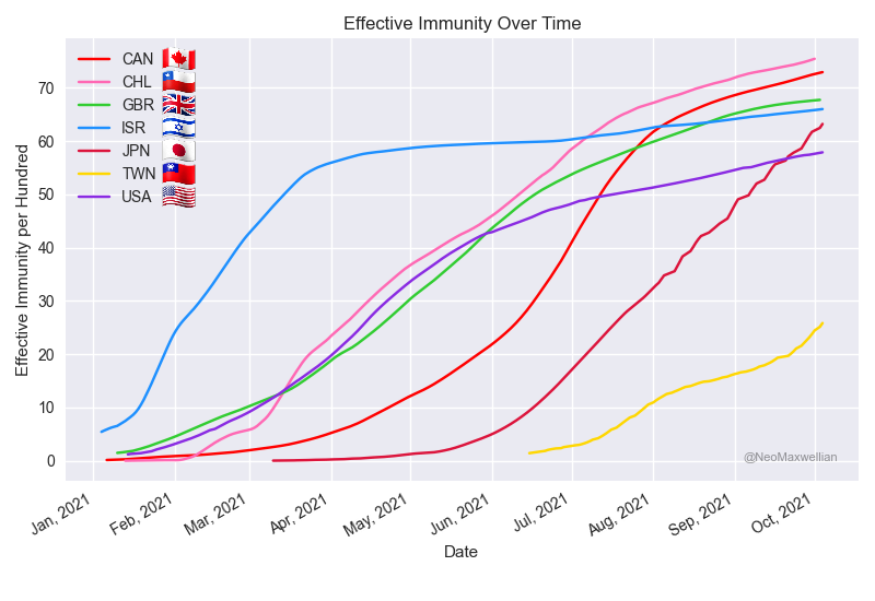
Canada versus The US
Anyone reading this where I live in Canada is probably most curious as to when we effectively passed the US4 . First let's look at the "at least one dose" and "fully vaccinated comparison" graphs (from OWID):
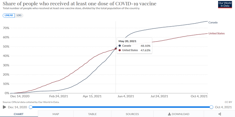
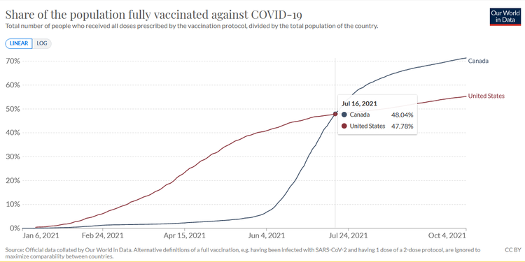
Looking at these graphs roughly we can see that Canada overtook the US on May 20th 2021 in percentage of overall population with at least one dose. From the second graph we can see that we overtook the US on full vaccinations on July 16th 2021.
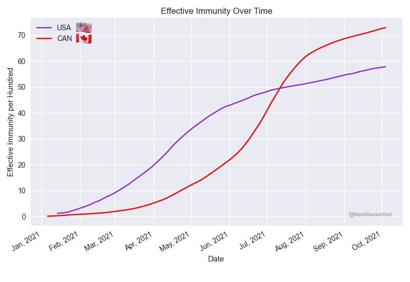
As we see here the crossing occurred in early July, looking at the data it was exactly July 9th 20215 . A huge distance between the overtaking on overall vaccination and effective immunity, much closer are the dates of overtaking on complete vaccination and effective immunity (only 1 week difference).
Happy to make the program
Making this was a lot of fun, it was something that genuinely made me curious as to what it would look like if we took effective immunity into account. Creating the program was also a great learning experience as I had a crash course in Pandas, Matplotlib and (unintentionally) Pillows. The funny part is that the most difficult aspect was getting the small emoji flags to be put on the graph automatically (not to mention downloading all the 200+ flags).
If you make any of your own comparisons send them my way, it would brighten my day.
Footnotes
1: Hopefully only a few ministers and health leaders were doing that
2: Compared to other western nations at the time that is, vaccine hoarding has not affected us at all.
3: Sorry Belizeans! The default colours on the style I am using only have six unique colours, so I had to leave one of the central american countries off.
4: Although we should probably strive to be as good as possible and not look only to our close neighbor.
5: The exact numbers on July 9th 2021 are 49.61 for the US and 50.41 for Canada.